Visualize complex log analysis and enhance them to answer tough questions easily
As human beings we are not capable of consuming data anywhere near the rate modern applications generate. We cannot touch data, hear it, smell it or taste it. However, we are amazing visual creatures. We have the power to summarize vast amounts of information into condensed visual form. Thus, the ideal method of consuming and analyzing data is through sight, through visualization. A picture speaks a thousand words and at DataSet we log all kinds of data at 200TB/day per customer. How can we put those words into a picture? This blog give details on how to create interactive visualizations with DataSet PowerQuery and Google Data Studio.
This is where two very important pieces of technology come together.
DataSet PowerQuery is the answer to the engineering question, “What if you could SQL query any data regardless its structure or preprocessing?” PowerQuery allows you to derive analytics from any data that you have ingested into DataSet. We can now question terabytes of data and receive a summary of the information. Preprocessing is recommended but can be done just-in-time via PowerQuery parse
The second important piece of technology we need is, of course, visualization. Google Data Studio is an easy-to-use data visualization and reporting tool. Data Studio allows you to connect to data sources through a wide variety of “connectors.”. This blog introduces the DataSet PowerQuery connector.
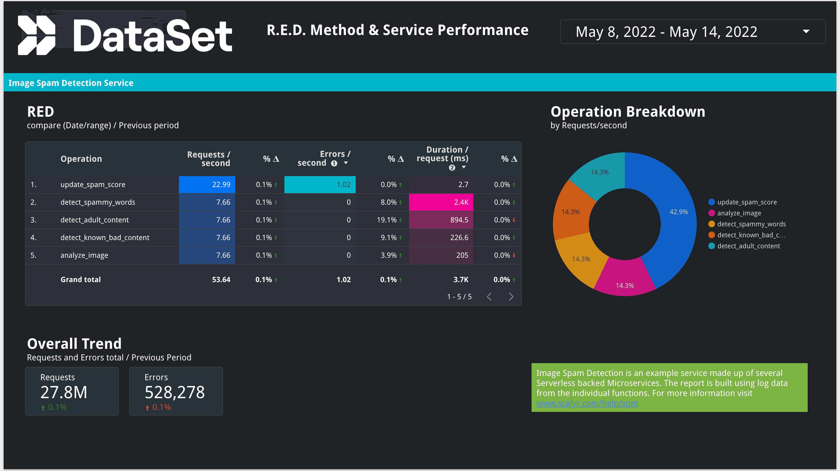
To demonstrate the DataSet PowerQuery connector and Google Data Studio visualizations in action, I have used data from DataSet's Service Performance Monitoring (SPM) live demo data. SPM allows you to automate the aggregation of logs into services and operations without changing your application instrumentation. After a mapping process, developers and SREs can easily view RED (Rate, Error, Duration) metrics and graphs for each service, and for each operation under that service. You can read more about DataSet SPM here.

Billions of logs lines are queried in a matter of seconds to have a near real time report on serverless microservices comprising a typical service. As you modify the date range, the corresponding data will load smoothly. Do we really need static reports anymore?
The DataSet service has its own useful visualizations for graphs, metrics and traces. They more than suffice for SRE/DevOps. Data Studio’s ability to combine disparate data sources, an inexhaustive list of new use-cases are possible for more people across the organization. This analysis can be done without moving your data around unlike traditional solutions that require data to be copied or indexed.
In summary, DataSet PowerQueries combined with Google Data Studio create powerful visualizations that are informative and quick to set up. Check out DataSet's documentation here, and to get the PowerQuery Connector, check out Google’s Data Studio connector gallery here. We look forward to hearing interesting stories from our DataSet community of users so do share with us how you are using the new Connector.
Get Started with DataSet
Don't have DataSet yet? Get started today with a free 30 day trial of fully-featured DataSet.

